Archie
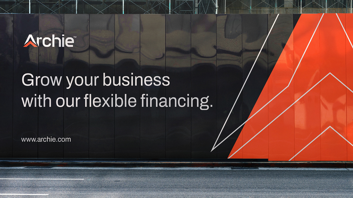
Archie is a start-up that operates in the field of funding property developers who have strong values and vision with a fair mechanism. Archie is here to be a solution for developers who want to start or develop their market but are constrained by capital for initial costs.
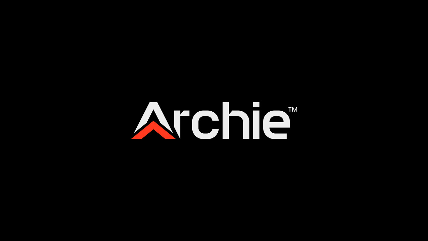
The Archie logo uses a wordmark logo type with a combination of the letter A, roof elements and arrows. The use of the roof element is a symbol of property in general which includes materials, design and contractors. There are two arrows or upward arrows in this logo, from the small one with the shape of a roof and the large one to form the complete shape of the logo which is also the shape of the letter A. Arrow in this logo means growth and progress to become better and bigger, which overall represents Archie as a start-up that provides funding to property developers to develop their market to be bigger and better.